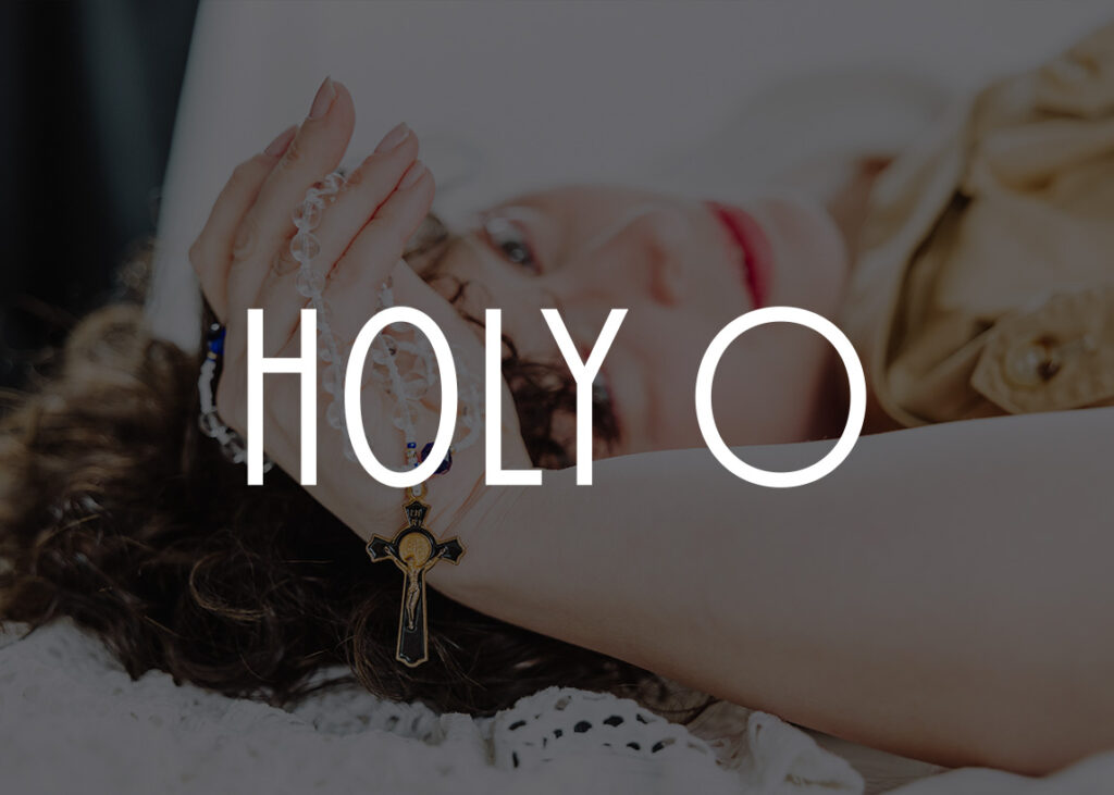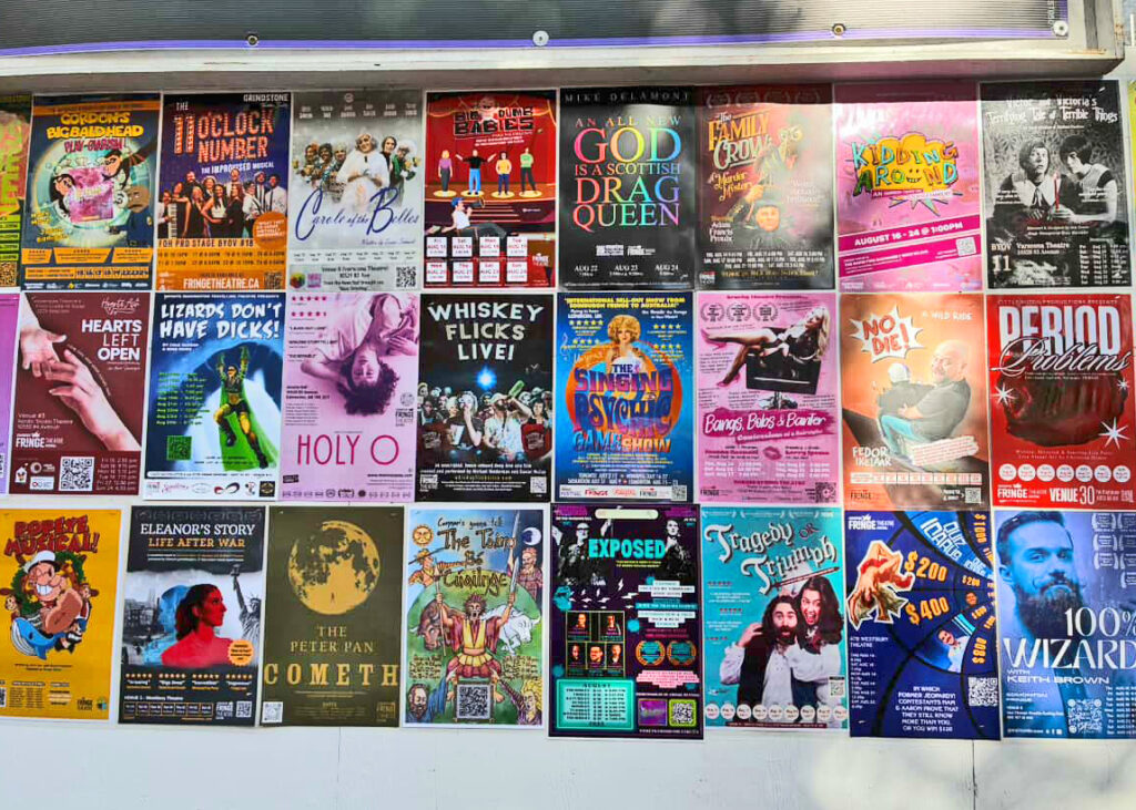
It was a pleasure to once again work with the lovely Lauren Hance, for who I designed the logo and branding for What the Fringe?!. I was thrilled when she reached out to me again, this time asking for my help to breathe new life into the poster and aesthetic of her play, Holy O, a story “exploring the connection between body, spirit, and sexuality” for her 2025 Fringe tour.

A poster or show image is one of the ways that potential audiences decide whether to buy tickets to a performance. An effective poster needs to have visual impact, and a striking photo makes a world of difference. For this reason, our project began with an in-depth consultation and planning of a professional photoshoot. Lauren picked Ray Kuglar as her photographer, and together they created some gorgeous images that were an absolute pleasure to work with.

Many of the photos were taken from above, with Lauren lying on her back. This perspective portrays vulnerability which was appropriate for the intimate subject of the show. Show posters usually have a lot of text, and to be legible, text must have a high contrast against the background. Often, posters will have bars of colour at the top or bottom that for all of the relevant information. Many great posters use this effective technique, but I am also a big fan of designs that use an image with a background that covers the entire poster, and I was excited to create such a design with this project. Photos with plenty of blank space around the subject makes for an image that is very flexible for graphic design and works well for placing text on top.
I applied a gradient map to the photo, which replaces dark and light areas with new colours. Choosing pinks and purples gave the photo a monochrome-esque appearance. Once the image treatment and poster layout was finalized, I recreated the design in Canva as a template that could be used for future shows. With each new festival, the poster needs to be adjusted with the relevant dates, locations, and festival logos, as well as adding new quotes, reviews and awards.

The existing high-contrast colour scheme was black and hot pink, which was rounded out with the addition of a pale pink colour that matched the poster design and lended some softness to the overall look and feel of the website and graphics created for social media.

